Since I’ve been in-between builder-ing jobs and find myself with a bit of time in the evenings, I had a look at my old “ridelikeaturtle” logo and thought it was time for a refresh. The old one, even after a previous cleanup, still looked a bit like a 10-year-old kid drew it freehand, and I thought I could make it better.
Maybe we should have a quick look at the evolution of the logo.
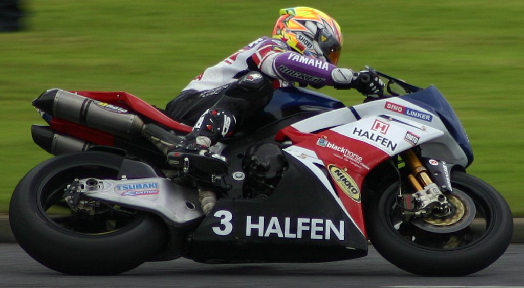
The concept (if it wasn’t clear) is combining a turtle (a sea turtle, to be more precise), and a motorcycle. One of my inspirational photos would be a sportsbike leaning well over in a turn, like this:
With that in mind, I put my little hands together and came up with something quite basic and rudimentary.

“Badly drawn”, but hey it’s a start.

Now we’re moving into a slightly smoother, cleaner look, but still “hand-drawn” and still a bit tribal. It’s not symmetrical either, but I’m not sure that’s always going to be possible… but let’s give it a try.

I wanted it a little fatter, with a more consistent shell pattern, and less “hand-drawn”; and the gold & black makes me think “Pontiac Trans-Am” and less of a tribal tattoo – which may be good or bad depending on your taste, but for the moment I like it.
Going vertical was another idea I had floating around in my head, and going to be quite a departure from the previous design, but why not? Let’s see…
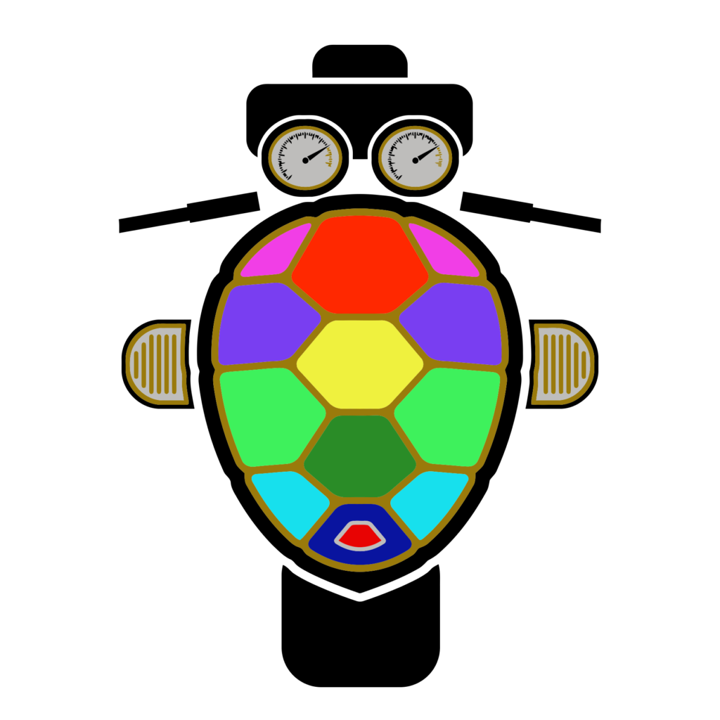
The jury’s still out on this one, but I like it. I know, fat rear tyres are no longer in style for choppers and cruisers these days, but I needed some balance at the back/bottom. Throw in a mini taillight, some handlebars, engine covers, speedo & tach gauges, to go with the fat colorful shell, and a fun experiment makes a nice change.
If you like either of the new designs, one much more than the other, or hate them both, feel welcome to say so on social media (see my Twitter link above). Also, I’ve integrated a Spreadshirt shop into the website, go to the “Shop” page and you can get a t-shirt or hoodie etc. with either logo on them.
Enjoy!
